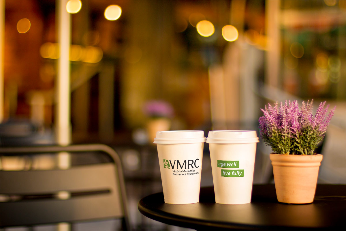
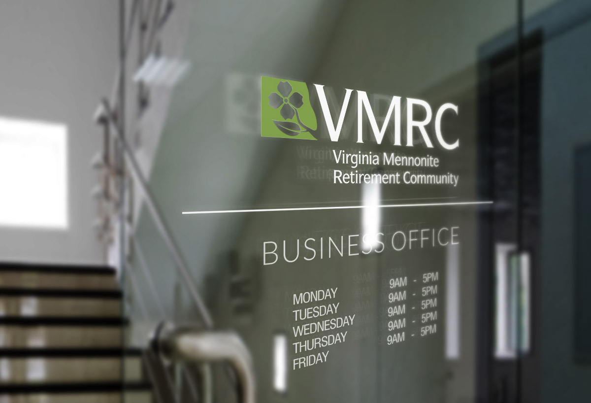
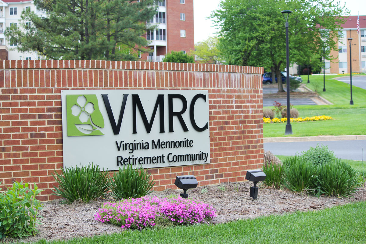
VMRC identity
VMRC is a continuing care retirement community in Virginia offering a complete spectrum of living options—from cottage homes to assisted living apartment homes, complete living care, memory care, and rehabilitation.
VMRC’s brand had not gone through a revitalization for many years and had become dated. In fact, their old logo included elements such as an old lantern in burgundy and gray colors that that seemed to give the false sense of a stale/traditional institution instead of highlighting VMRC’s vibrant and progressive community.
This was probably one of the most challenging logos I’ve worked on because of all the dynamics at play. Creating something that was unique and memorable, while visually communicating some of the community’s key values, was not an easy task. After some brainstorming, sketching and initial concepts, the one element that seemed to stand out as having the most relevancy was the dogwood. Not only is the dogwood tree (and its unique-looking blossom) typical of the Shenandoah Valley area, but it offers strong connections to concepts at the core of VMRC’s values such as growth, life, compassion and genuine relationships.
Some keywords/phrases that guided the logo design:
- Growth
- Life/Living
- Genuine Relationships
- Connection
- Personal, Individualized Care
- Innovative/Progressive
- Mennonite Heritage & Values
- Compassionate
- Resident-Centered