E3 Ministry Group
Identity and promotional material
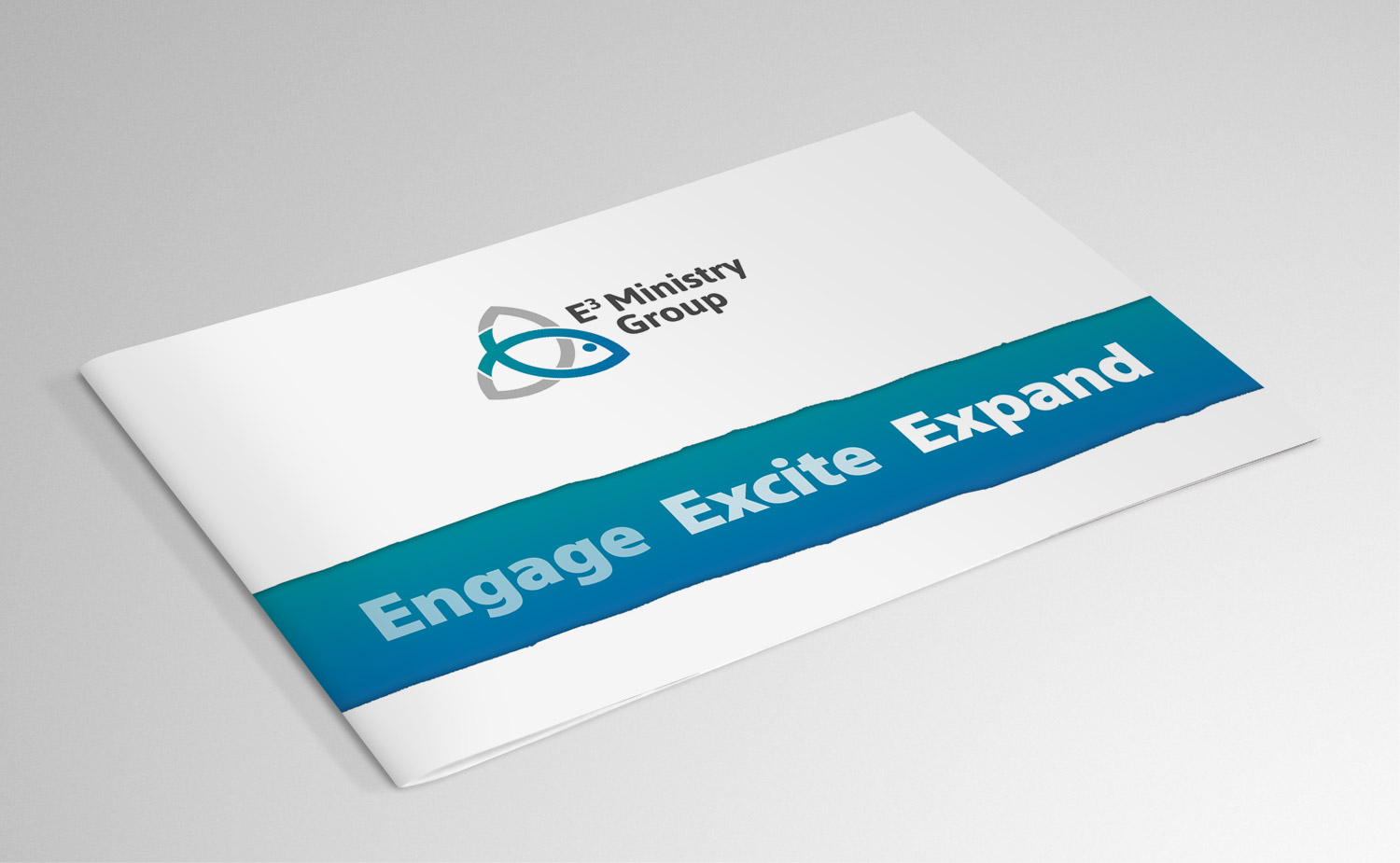
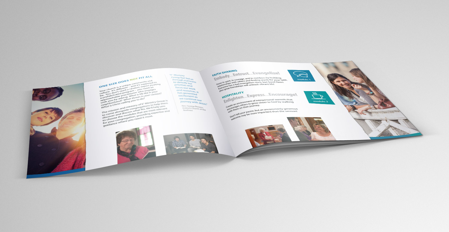
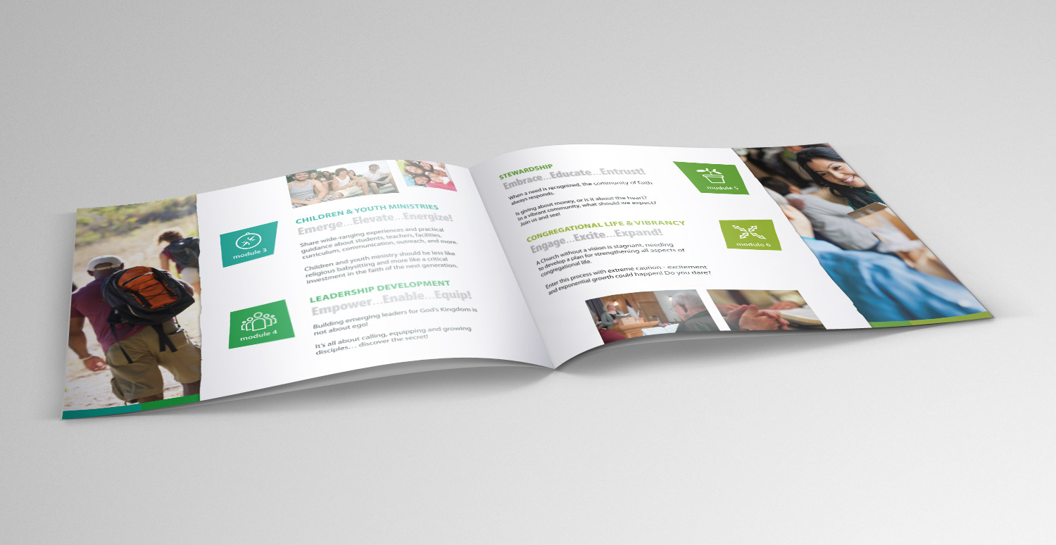
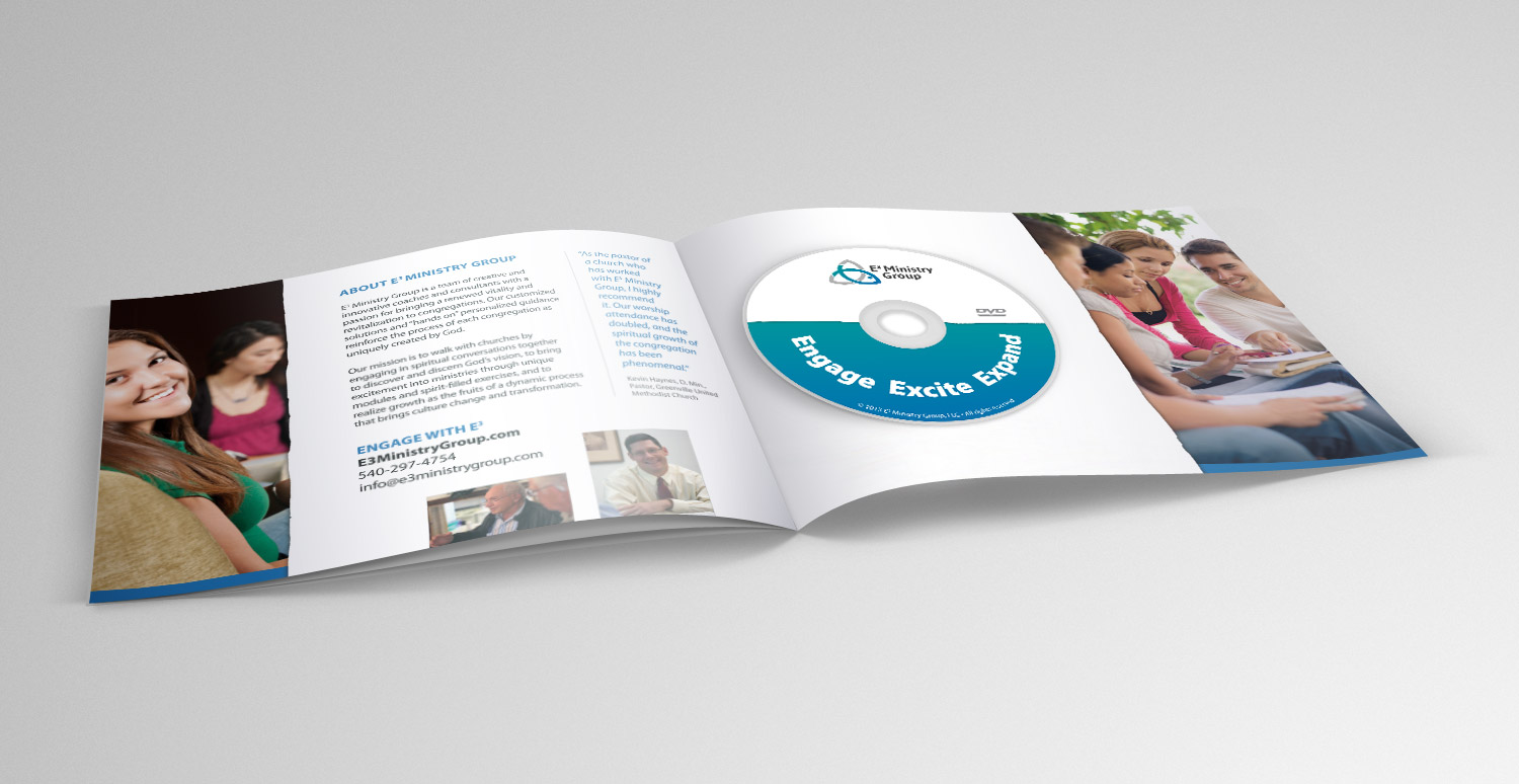
E3 Ministry Group provides effective strategies, resources, and consultation to engage and excite churches looking to strengthen congregational life and expand their reach. E3 stands for engage, excite, expand.
For their logo we were looking for something that spoke to both the contemporary and traditional audience groups. As the tagline suggests, this is a dynamic group, not one that cranks out a one-size-fits-all package. The idea of “movement” and “dynamism” played a key role in the direction of the logo design.
Inspirational words for logo development included:
- Engage, excite, expand
- The power of 3
- Father, Son, Holy Spirit
- Dynamic
- Growth
- Transformational, life-changing
I developed several possibilities based on these concepts (I’ve included some of them here in my portfolio), but in the end everyone agreed on the “winning logo”. The winning concept was a merging of two strong symbols: the fish and the triquetra. The fish is obviously loaded with Christian meanings like discipleship, sharing faith (fishers of men), community life, and of course it’s a symbol which has been used by the church for centuries (which speaks to the more traditional audience and acknowledges the role of history and tradition in faith). The triquetra speaks strongly to the concept of “power of 3″ (3 corners, the trinity, the 3-part mission of E3 to “engage, excite, expand”.
My work was guided by the solid research and identity study done by Gravity Group of Harrisonburg, Virginia. I worked closely with
What I did:
- Logo design
- Identity design (accompanying graphics, colors, symbols, etc)
- Presentation brochure
- Stationery package
- Display banners
- Book cover