Church of the Incarnation
Branding and stationery pack
The newly-formed Church of the Incarnation was off to a good start. They had vision. They had community. They had faith. What they lacked (yet!) was a visual identity – something simple that would communicate a sense of what they are about. I worked closely with one of the members of the church committee to get a better understanding of some of the distinguishing characteristics of the church (style, mission, distinctives, etc.) and how those might be effectively communicated visually.
Some things I kept in mind as I was working on logo development:
- informal in style, yet following Anglican liturgy
- relationship-oriented
- simple (lifestyle)
- “…on earth as it is in heaven” – good summary phrase of what the church seeks to be
- The strong shape and deep meaning of the Celtic cross resonated well internally
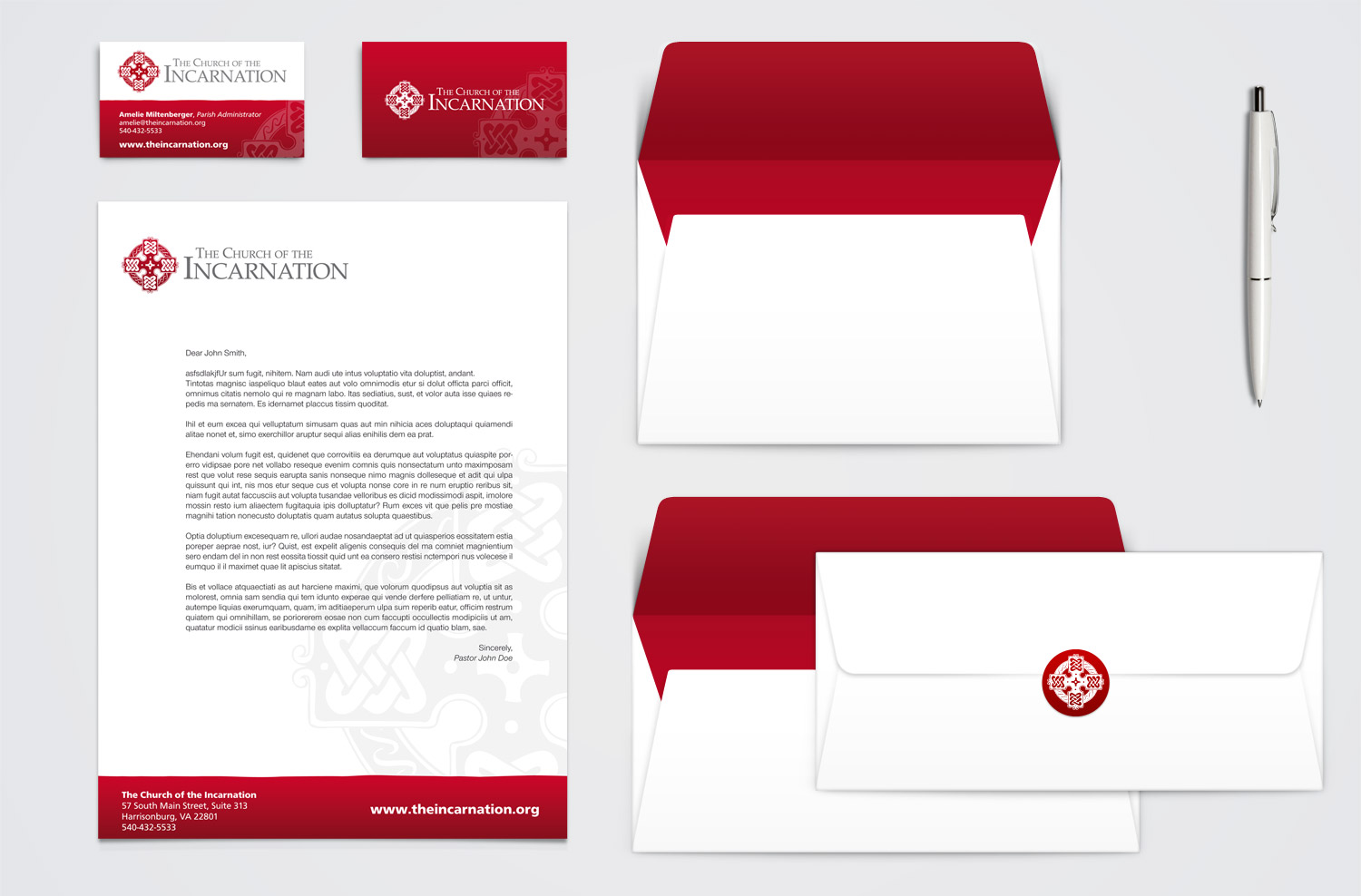
Early in the design process it became clear that the equilateral (Celtic) cross would most likely be the key element in the logo because of the strong visual symbolism which communicate so much of what The Church of the Incarnation is about. The vertical and horizontal overlapping “arms” of the cross are a clear illustration of the interaction between human and divine relationship (the Kingdom of God on earth; sharing the gospel to our neighbor). The circle speaks of balance, of faith, of life.
I did a good bit of looking at traditional Celtic crosses as I worked on design ideas. Although there are some common features, there is also a good bit of variance in the inside design and patterns. I tried a variety of ideas for inside the cross shape, but ultimately chose to use simple interwoven lines in each side of the cross. This helped both in maintaining simplicity (some Celtic patterns can get quite “busy”) and accentuated the relational aspect of the church.
I think the thing that I struggled with the most on this particular logo was getting the right style. I started out working on a very crisp sort-of modernized rendering of a celtic cross. I even played with abstracting it a bit. I wanted to emphasize the “simplicity” aspect of the church and was trying to stay away from it being too formal. But some of my initial ideas resulted in a style that did not properly acknowledge the church’s deep traditional roots. Some versions were almost too modern or minimalistic. What ended up working out the best was going back to the ol’ sketchpad, drawing a celtic cross by hand, then scanning it and cleaning it up in Illustrator. This gave if a bit of an irregular hand-sketched look while keeping a more traditional cross shape and decorative pattern.