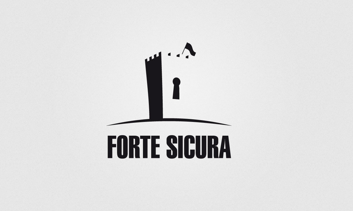
Forte Sicura
Forte Sicura makes padlocks, keys and door locking systems.
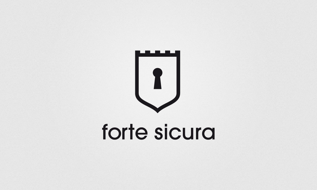
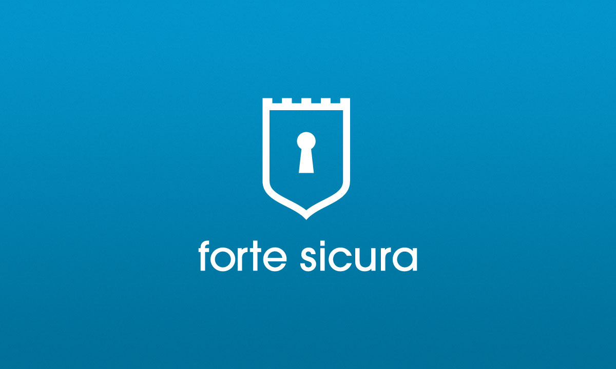
I wanted to keep their logo simple and minimal for several reasons (besides the usual ones). The name “Forte Sicura” (an Italian brand) evokes very strong visual images – which is always dangerous, since designs that are too literal can quickly become cheesy or cliché. The word forte means strong, but it is the same word used for tower. The word sicura means safe but it can also refer to a safety box. So I wanted to use both of these alternate meanings of the word in some way in the logo, but do so keeping the lines as simple as possible.
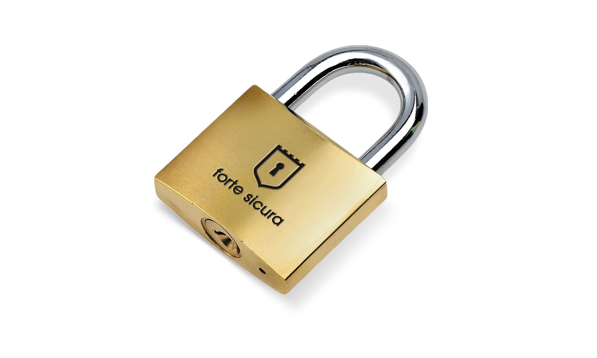
Another reason the logo needed to be particularly simple was that it would often be engraved on metal products (like on a brass padlock).
Combining these two concepts (tower and safety) with that of a shield turned out to be a good choice. The shield shape gives the logo the importance it needs – evoking the idea of stability through time (like family shields which have been around for centuries) and reinforcing the idea of strength (shields used as defense in battle).
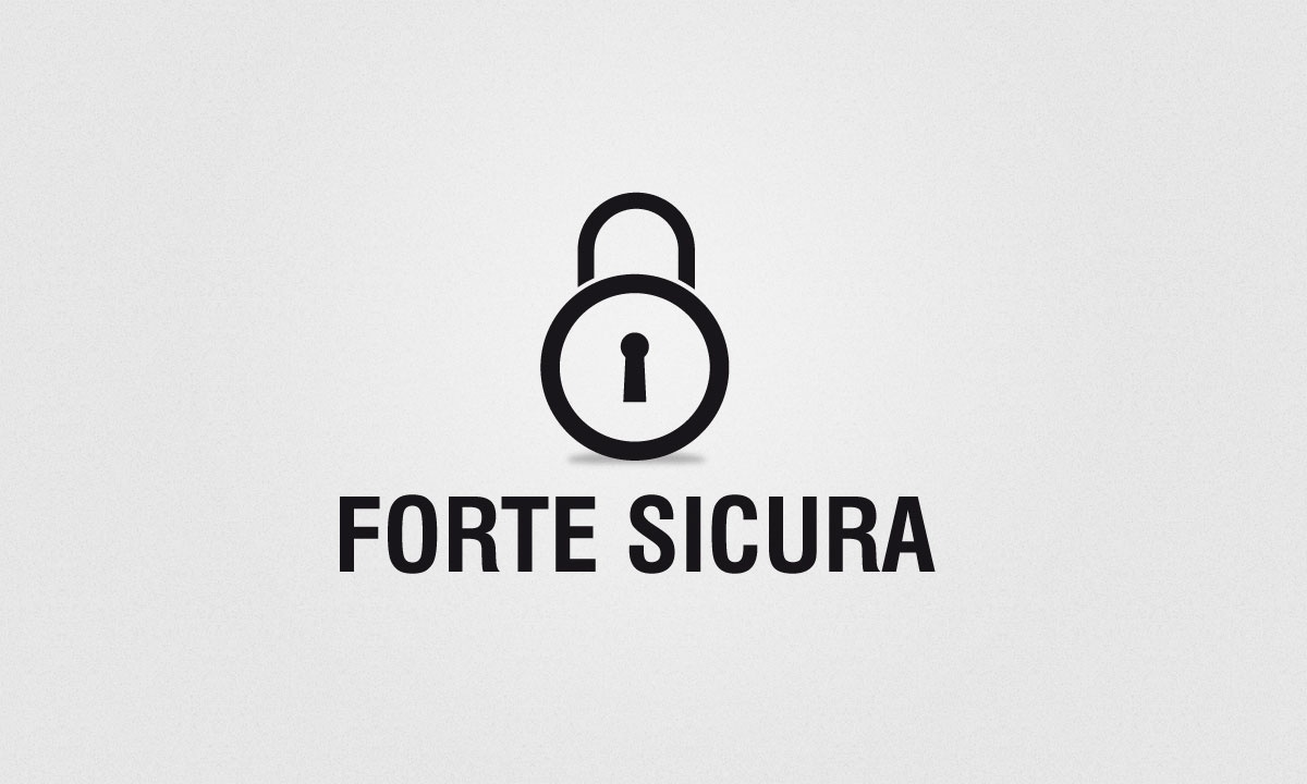
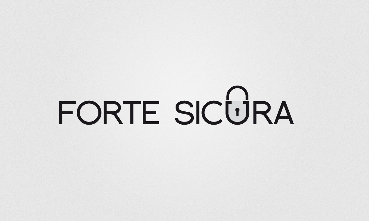
I thought some of the alternate options for the logo (proposed, but not chosen) were good possibilities as well. Check them out at top.